UX Design for Healthcare and Medical Apps Case Study
Heavy data, simplicity, clarity. Can we include all of these in healthcare app designs? Are you planning to hire a healthcare software development company to design and build your healthcare or medical solution? Check out the UX design challenges that you might face developing eHealth applications. Eventually, find out how to design medical data in a UX-friendly way.
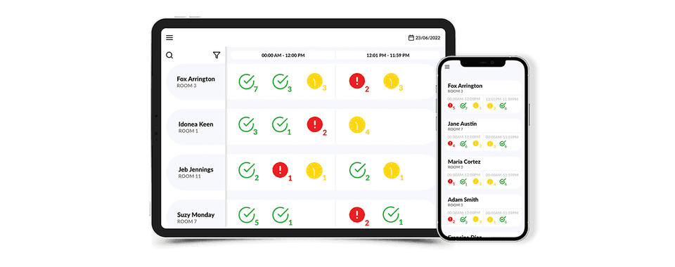
Designing data for eHealth applications
In some cases, healthcare apps have to provide users with lots of information. As an example let’s work on a hypothetical app for hospital staff whose purpose is to help manage patients' medicine distribution.
In the case of healthcare apps, there is usually a lot of information that has to be designed in a way that is visible and accessible within a few taps or clicks.
transform your HealthTech startup or SME with our expert guide
Challenges for healthcare UX design
Designing the eHealth app for hospital staff requires dealing with these challenges:
- How to prioritize information?
- How to display data in the most accessible way, preferably on the main screen so users don’t have to look for it on different screens?
- How to display all necessary information about patients on a tablet and even on a smartphone?
For the purpose of this blog post, we created a hypothetical mockup for an app for doctors and nurses working at the hospital. This is the possible answer to all of these challenges:
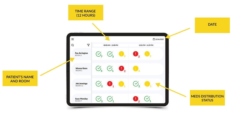
“Wow, that's a lot of information on one screen…” That is something that you could think of looking at the design. You instantly notice that this is not a nice lifestyle app that is supposed to attract you with a fancy design and a small amount of text.
Remember we are talking about an app for hospital employees and we need to meet their requirements. According to our research made while working on various eHealth products, the number 1 priority for eHealth app users is fast access to all necessary information thus they should be visible on one screen. In this case, doctors and nurses have access to patients’ names, rooms, and medicine distribution statuses on one screen.
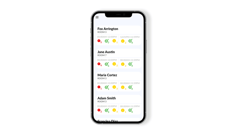
Designing everything on one screen? That’s a challenge. A product designer’s instinct tells us to remove as much data as we can to present a more clear message. Yet, doctors and nurses know best what information needs to be quickly accessible to them and our job as healthcare app developers and app owners is to design it in the best possible way.
What else do you need to remember while facing these healthcare UX challenges? Check out UX best practices that help to deliver healthcare apps useful for their users.
Iconography in product design
The key in UX design is iconography which practically creates its own language to display information. So, you design icons that represent statuses, states, notifications, etc. Icons should be comprehensive even if we design them specifically for the app. They still should evoke the right associations. This best practice was deeply covered in Jakob Nielsen’s Usability Heuristic #2.
Naturally, the explanation of every icon in the product is still recommended. Because we are talking about an eHealth app that supports medicine distribution so users have to be well prepared to use it.
The icons that you can see are well-known and characterized by an immediate clear meaning. Even without knowing the app, we instantly understand the sentiment of the message that the icon is supposed to give us.
For sure, a very important part of these messages is coloring. 🙂
Color coding in product design
In UX design color, like iconography, has a special role.
As it is common in the digital world it originated from the past. 😉 It has been used in industries like electricity or hydraulics.
If you ever renovated your apartment, you probably know that the plumbers' rule says that pipes with hot water are marked with a red color and pipes with cold water with a blue one.
In the case of electricity, in almost every electrical drawing you will find a ground marked in yellow and green colors. These are examples of color-code good practices from other industries.
To be fair, color coding could be found much easier, simply by walking in the street… 😉

UX design for offline mode
Apps accessible offline are called offline-first apps. Offline mode is often an essential feature in healthcare apps and usually a huge challenge itself. When it comes to life-death situations you cannot rely on the internet connection. Following our case study example, the hospital staff has to have access to the app 24h a day even if there is an issue with the Wi-Fi connection. That’s not all though. The offline mode has to be followed by the right design.
UX design for the offline mode has to emphasize:
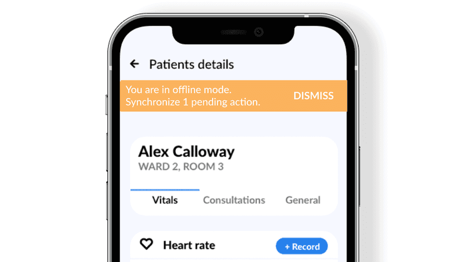
- That the app is working at the moment in the offline mode.
Seems obvious but when you have to tap that somebody has taken meds, better to be ensured that your data needs to be synchronized.
- What kind of data was provided in offline mode.
- If data were synchronized after restoring the internet connection.
Clear communication about statuses is the first of Jakob Nielsen’s ten heuristics.
This is the mockup example including the top bar showing that the app is in offline mode:
Can a beautiful design be ugly?
UX design in healthcare software development is all about managing the data. So users are able to... manage data as well. Sometimes these apps cannot be full of beautiful designs because this is simply not what users expect. Yet still, eHealth apps do their job and support medical staff actions. And these are the product design’s true colors. Good design exists only if it works. Isn’t that pure beauty indeed?
Special thanks to Alisa for her inspiration and contribution.
