Coming Back to Bright Roots
Probably you have noticed that we gave our brand a face lift. We are excited to finally unveil our new look, and we want to tell you all about it.
Our new visual identity has to satisfy all of the existing expectations of what our original values are while moving the brand forward at the same time. Throughout the rebranding process we have been continually focused on our key values: responsibility, flexibility, teamwork, positive attitude and client orientation.
We have come a long way since our brand was founded in 2012. We have learned a lot and felt that our previous logo and colours did not represent who we are anymore. Originally, we focused on mobile centralised solutions, but since then, we have expanded our services to help clients create innovative omnichannel digital experiences.
We figured out that a new logo would fit best since we want to create and grow the company based on the original foundations and goals we had in mind when Bright Inventions was started. We wanted to show who we are and how we began. We brainstormed, argued, persuaded each other, negotiated, discussed, debated, and we really did have loads of awesome ideas. And after several months we reached a consensus, all in favour of keeping our core values and coming back to the roots. That is how our new-old logo came into existence.

Looking at our current logo you can notice an orange square which also used to be a part of our first logo in history. Orange is linked with energy and optimism that you can always feel when you meet our team. The square symbolises our strong foundations, integrity and being practical. It is only through teamwork that we achieve brightness. We are committed to helping our customers by working together with equal parts of humility and ambition.
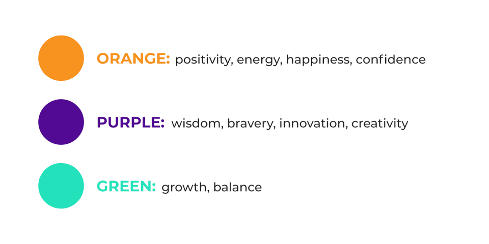
Changing our visual identity was a true breath of fresh air. One would say that we have made a bold decision to put together the shades of orange, green and purple. But it is like putting together all fundamental values we represent. We balance ambition with flexibility because what matters is the final result. We work together to bring our passions and expertise to make Bright Inventions the best place it can be. And above all we love what we do and the people around us. In fact, we believe that happy people are more motivated, efficient and creative, so we bring a positive attitude to everything we do. It’s good for you, for the team, and for our customers.

The rebranding includes a redesign of the company’s logo, graphics, website, communications and correspondence. Bright Inventions' new brand assets include a simplified black-and-white logo and symbol with a hint of innovation reflected in an orange square, along with other visual communications that utilise simple iconic graphics to convey complex solutions in an understandable way. One part of the text in logo is bold. We did that to create the hierarchy of importance between "bright" and "inventions". We wanted to emphasise the process of creation in our work. We create software solutions to our clients problems, solutions that are strong and clever. At the same time we create success stories for many startups, consultancy agencies as well as mid-size organisations.

