30th Anniversary of Nielsen’s Heuristics - Real Life Examples in Transport Management System
30 years ago, one of the pioneers of UX, Jakob Nielsen introduced 10 usability heuristics, which now have become the general rules of thumb when it comes to designing digital products with better user experience. What are the now iconic heuristics? How do we apply these principles when designing products? Let me show you.
1. Visibility of the system status
The design should always keep users informed about what is going on, through appropriate feedback within a reasonable amount of time.
To achieve that we need to make sure the system communicates every action the user takes. We shouldn’t leave them without any feedback. Let’s take a look at the TMS app:

We’re explaining to users who clicked on an offer, which has expired, why they cannot go further in the system with it, by showing a toast for a few seconds with appropriate information.
2. Match between the system and the real world
The design should speak the users' language. Use words, phrases, and concepts familiar to the user, rather than internal jargon. Follow real-world conventions, making information appear in a natural and logical order.
Icons that inform about the status of the car, such as loading, unloading and en route. They’re clear, have one meaning and correspond to the users’ mental model.

3. User Control and Freedom
Users often perform actions by mistake. They need a clearly marked "emergency exit" to leave the unwanted action without having to go through an extended process.
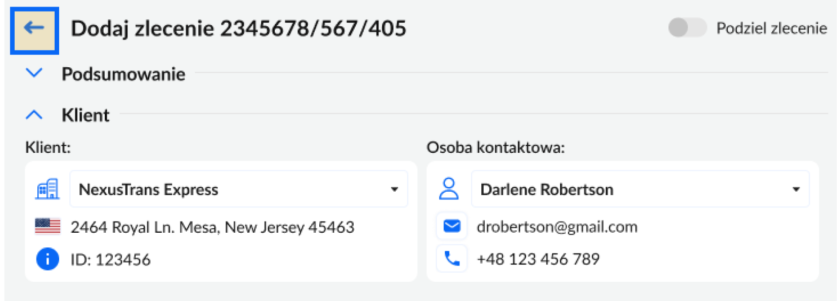
Clear navigation and an accessible back button are always available. This allows users to exit whenever they want to and freely navigate through the whole application.
4. Consistency and Standards
Users should not have to wonder whether different words, situations, or actions mean the same thing. Follow platform and industry conventions.
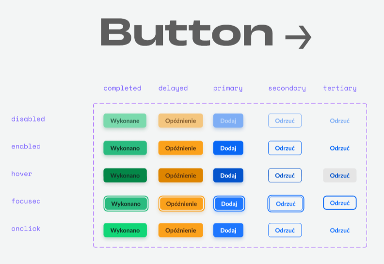
No matter what the button's purpose, the pattern of the state, whether they’re disabled or focused, should always stay the same. That way, whenever the user interacts with it, they know what’s going on and it enhances the learnability aspect of the system.
5. Error Prevention
Good error messages are important, but the best designs carefully prevent problems from occurring in the first place. Either eliminate error-prone conditions, or check for them and present users with a confirmation option before they commit to the action.
Before performing a significant action that could have an effect on other instances, always confirm with the user. There’s always a possibility that the user clicked on it by mistake. What then?

6. Recognition Rather than Recall
Minimize the user's memory load by making elements, actions, and options visible. The user should not have to remember information from one part of the interface to another. Information required to use the design (e.g. field labels or menu items) should be visible or easily retrievable when needed.
In the case of TMS application, when it comes to field labels - they are visible all the time. Let’s imagine a scenario in which you, as the user, are filling out a form. You swiftly move from one field to another, you click on another field and all of a sudden someone needs your help, they’re shouting your name, asking you questions and once they’re done, you have to take a minute to remember what field you were on, since you had already clicked on the field, the placeholder is gone. But thanks to the floating label, you don’t need to think about it, you already know what you’re supposed to type in.


7. Flexibility and Efficiency of Use
Shortcuts — hidden from novice users — may speed up the interaction for the expert user so that the design can cater to both inexperienced and experienced users. Allow users to tailor frequent actions.
Those users who are more experienced might want to narrow down the offers to specific ones. In this case, filters and sorting will help reduce the amount of offers and show the ones that are wanted.

8. Aesthetic and Minimalist Design
Interfaces should not contain information that is irrelevant or rarely needed. Every extra unit of information in an interface competes with the relevant units of information and diminishes their relative visibility.
Hierarchy of information is crucial here. It helps to avoid visual clutter and reduce cognitive load.

9. Help Users Recognize, Diagnose, and Recover from Errors
Error messages should be expressed in plain language (no error codes), precisely indicate the problem, and constructively suggest a solution.
The user knows that they need to insert the correct date in the appropriate format. The message is clear, the date format is given, so that there’s no doubt about what should be corrected.

10. Help and Documentation
It’s best if the system doesn’t need any additional explanation. However, it may be necessary to provide documentation to help users understand how to complete their tasks.
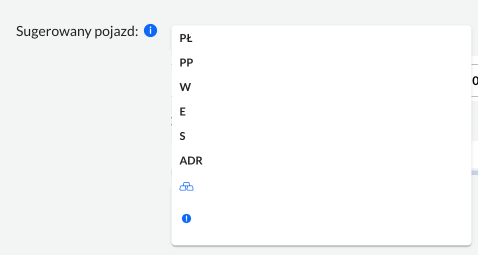
In such cases, a hover interaction on the information icon explaining what the shortcuts might mean for the new users is always available by the “suggested car” label.
As you can see, 30 years have passed since Nielsen introduced the guidelines of creating a user-friendly interface, however they’re still very much true. It’s likely that they will apply for the future UI. The question is whether (or how much) will they adjust to new technologies?
You can find out more about heuristics here: nngroup.com/articles/ten-usability-heuristics
