Payment in POS Design: UI/UX Best Practices and Inspirations
If you develop a point of sale system for the hospitality and retail industries, you're aware that your end users are busy. Whether they're waitstaff or shop assistants, they need to complete payment processes quickly. Every additional screen or unnecessary animation will slow them down, potentially leading to lost revenue for these businesses. Follow best POS UI design practices when designing payment features for hospitality and retail.
Think you know your POS user persona?
Include these practices for payment UI in POS design
Before we dive into, let’s remember that our end users are waitstaff, shop assistants, and hotel receptionists. They work under significant stress and time pressure, managing as many clients as possible to drive revenue for the business. POS design and technology should accelerate their processes, not only improving efficiency but also enhancing customer satisfaction.
Use animations for information purposes only
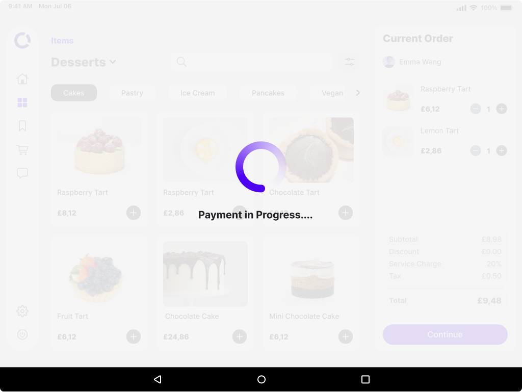
Avoid purely decorative animations, as they can slow users down. Focus on including only informative animations that provide essential feedback, such as indicating when a payment is being processed.
Include easily understandable icons with labels
When presenting multiple options, such as payment methods, it's crucial to include clear, intuitive icons to minimize errors. To ensure accessibility, pair these icons with labels, making their meaning unmistakable.
Establish button hierarchy in POS design
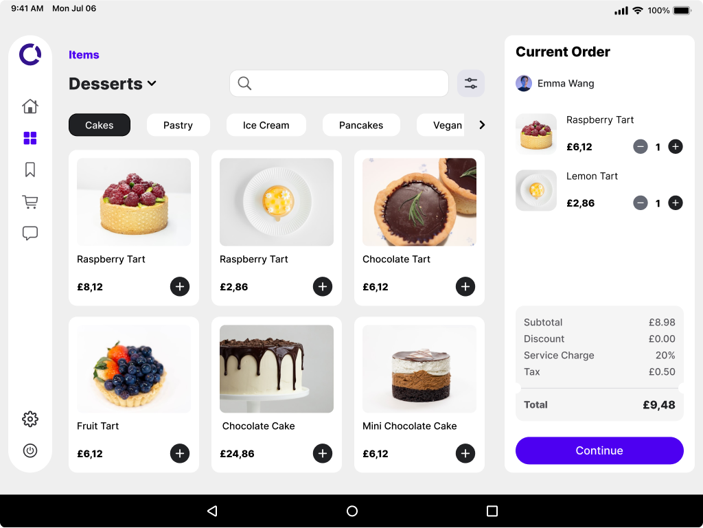
Emphasize the most frequently used buttons by making them larger and more prominent, while less commonly used buttons should be smaller. This helps guide users toward the correct action efficiently.
On the order management screen below, you’ll find several clickable options. However, the most important action, “Continue,” is designed to stand out due to its distinctive color and size, ensuring smooth navigation through the ordering process.
Keep forms simple
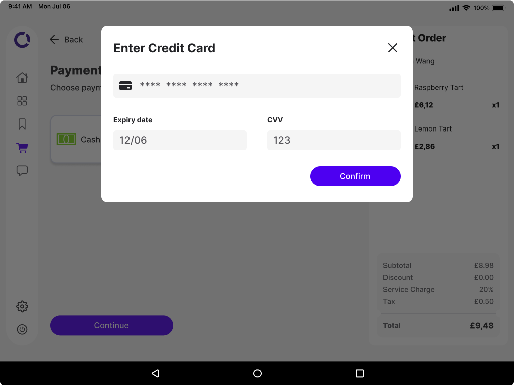
Some payment methods, like card payments, require filling out forms. To make this process intuitive, design fields in a way that simplifies data entry. Best practices for form design include stacking fields vertically, placing labels directly above each field. This layout aligns with the natural top-to-bottom way users scan information, whereas placing labels to the side forces them to shift their focus, slowing them down.
Don’t make me think
You might be familiar with the book “Don’t Make Me Think”, which highlights usability practices based on the principle that interfaces should be so intuitive that users can navigate them effortlessly. This is especially important in POS design – you should offer users clear options without making them overthink their actions.
For example, when it comes to tipping, don’t force waitstaff to manually input an amount. Instead, present them with popular tipping options while still allowing customization if needed.
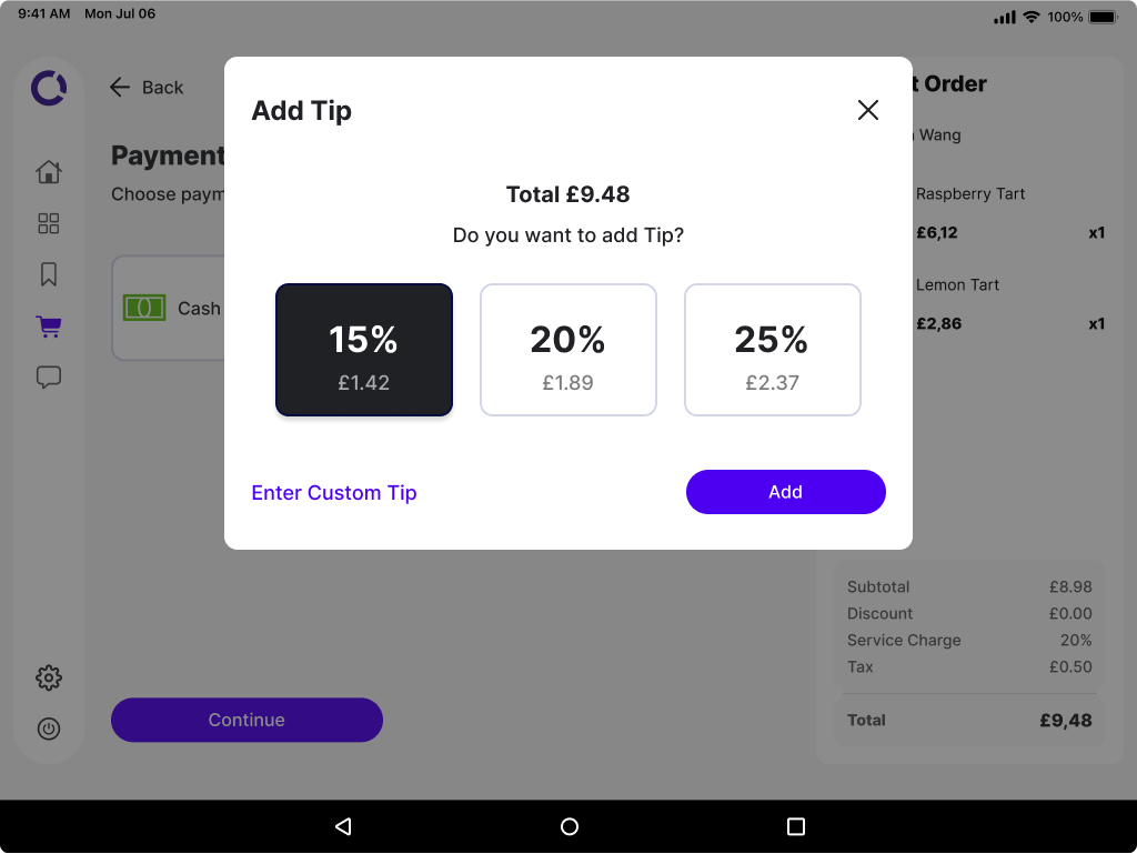
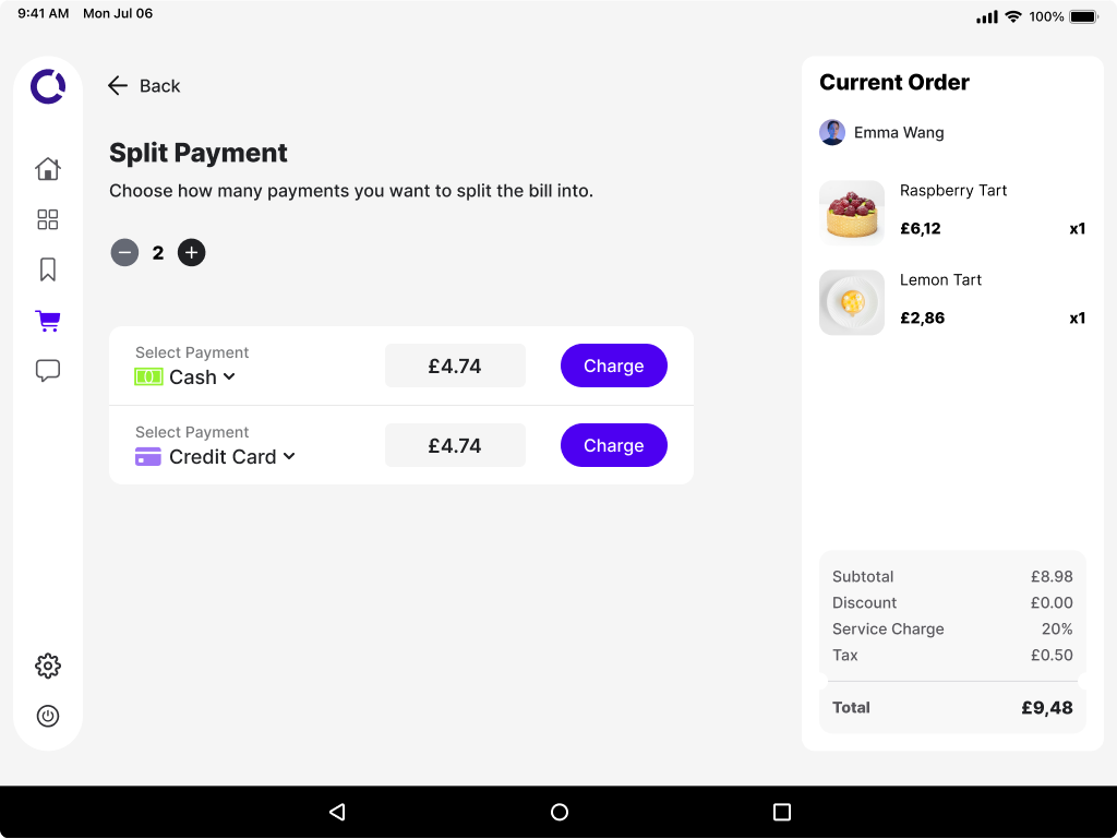
Another great example of the Don’t Make Me Think principle is the design of split payment in POS systems. The underlying mechanism should handle all the calculations for the users, while the interface remains as simple as possible. Waitstaff should only be required to input information like the number of splits and payment methods.
As demonstrated, the end user simply provides the number of splits and payment methods, and the POS system guides them through the entire process seamlessly.
The Point of Sale design was created by Aleksandra Zawisza, a Product Designer at Bright Inventions, a POS software development company.


